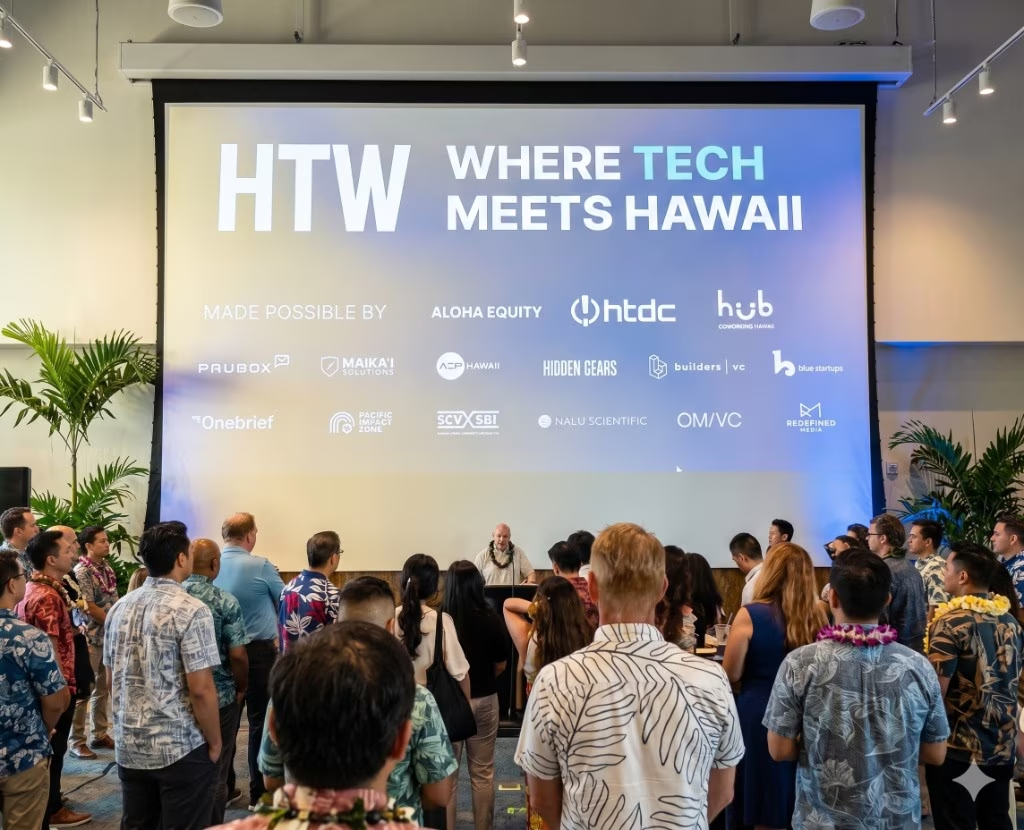
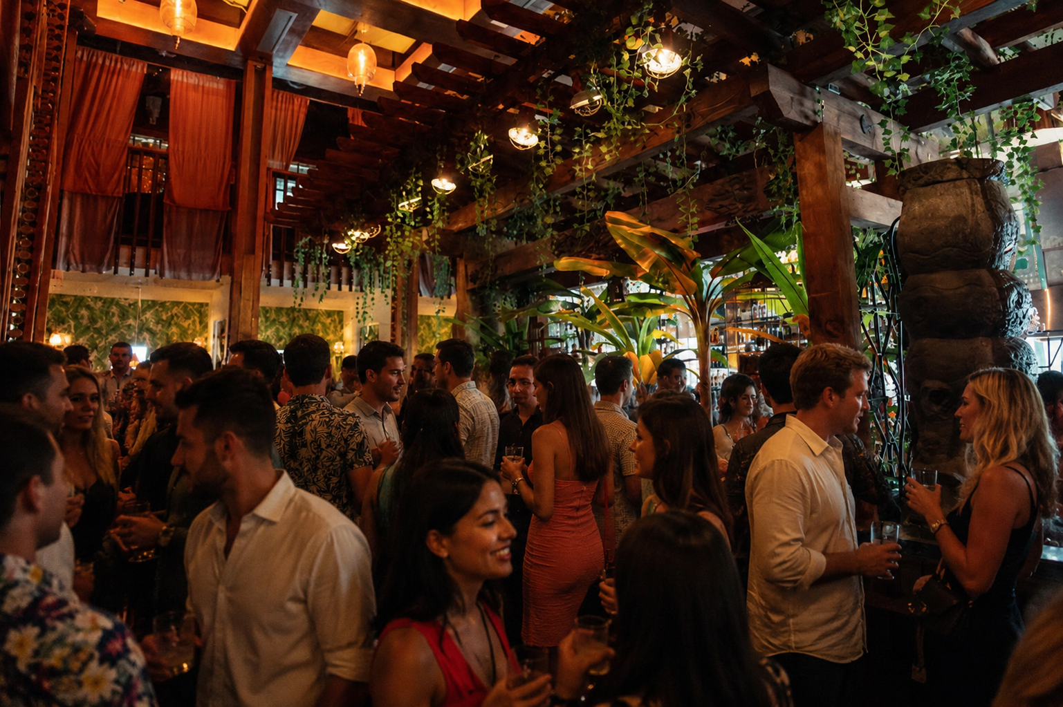
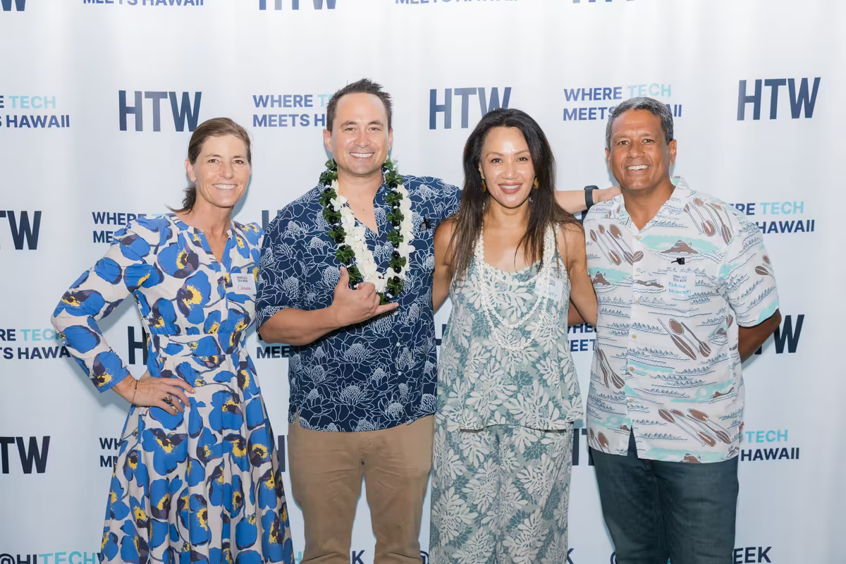
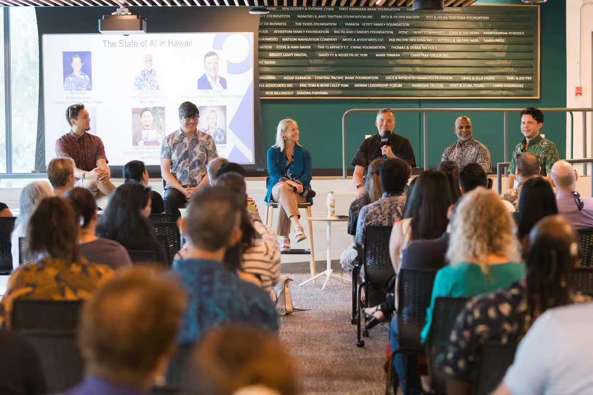
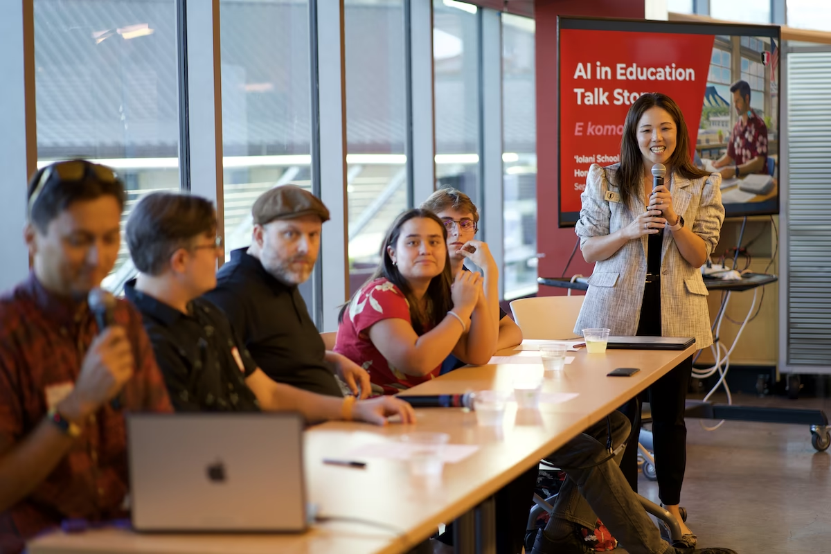
Navy and royal blue hold the experience together. Gold guides the next action. Large sentence-case typography, fine borders, clear controls, and full-width media give the site its product feel. This is a composition example, not a new campaign headline.
About precedes featured media on the homepage. Editorial sand gives that explanation a warm reading surface. Photo and video carry the people, technology, and energy of the week.
Existing media demonstrates shape and placement; final media can evolve.
Green has a supporting role.
Use it for community, nature, and selected active states. Keep primary actions gold and the footer navy. White remains useful for forms, tools, and report reading areas. Solar Cream (#FFFAEC) remains an existing utility; it is distinct from the editorial sand shown here.
HTW Navy#04153D · Canvas
Royal Navy#002868 · Depth
Royal Gold#FFB81C · Actions
Royal Green#1B7A5A · Nature
Soft green#B9D8B0 · Accents
Blue highlight#91B8EC · Headings
Muted blue#B7C6DF · Body text
Editorial sand#F2EEE3 · About
Hawaiian Royal Heritage
King David Kalakaua (1836-1891), known as the "Merrie Monarch," was Hawaii's last king and a champion of Hawaiian culture, arts, and modernization. His royal standard featured the colors of Hawaiian royalty:
Royal Navy Blue (#002868) - The Pacific Ocean and royal authority
Royal Gold (#FFB81C) - The sun and royalty (kapu to commoners)
Royal Red (#CE1126 - 'Ula'ula) - Sacred to Hawaiian ali'i (chiefs)
Royal Green (#1B7A5A) - The land ('aina) and growth
By anchoring HTW's brand in these royal colors, we honor Hawaii's heritage while symbolizing the innovation and forward-thinking spirit that defined Kalakaua's reign — the perfect metaphor for "Where Tech Meets Hawaii."
Brand Colors
Core brand palette built on Hawaiian heritage. HTW Navy is THE primary (matches logo). The four secondaries each play distinct roles.
Primary Brand Color
Primary
HTW Navy
#04153D
Logo color, headers, primary backgrounds
Secondary Brand Colors
Navy
Royal Navy
#002868
Gradient base, ocean depth, heritage
Gold
Royal Gold
#FFB81C
PRIMARY CTA buttons, highlights, warmth
Gold Hover
Royal Gold Hover
#FFC843
Hover state for Royal Gold
Green
Royal Green
#1B7A5A
Nature ('aina), success states
Cyan
Neon Cyan
#00D4FF
Tech energy, focus states, Hawaii Vice
Red
Royal Red ('Ula'ula)
#CE1126
Sacred to ali'i, error states
White
White
#FFFFFF
Primary neutral, text on dark
Status Colors
Each status has a Dark variant (solid, for icons and borders) and a Light variant (tinted background for banners and toasts).
Dark — Solid
Success
Success Dark
#1B7A5A
Icons, borders, solid badges
Warning
Warning Dark
#F59E0B
Icons, borders, solid badges
Error
Error Dark
#CE1126
Icons, borders, solid badges
Info
Info Dark
#00B7D6
Icons, borders, solid badges
Light — Tinted Background
Success
Success Light
#d1fae5
Toast/banner backgrounds
Warning
Warning Light
#fffbeb
Toast/banner backgrounds
Error
Error Light
#fee2e2
Toast/banner backgrounds
Info
Info Light
#dbeafe
Toast/banner backgrounds
In use — status banners combine Light background + Dark border/text:
✓ Success:Registration confirmed! Check your email.
⚠ Warning:Early bird pricing ends in 3 days.
✕ Error:Payment failed. Please try again.
ℹ Info:New speakers announced for Day 2.
Accent Colors
Three accent families, each with a light-mode and dark-mode variant shown side by side. Coral is the same in both modes.
Light Mode
Ocean
Deep Teal
#007C91
Ocean moments, decorative
Futuristic
Ultraviolet
#7C3AED
Tech/futuristic moments
Warm
Coral
#F06A6A
Warm, friendly moments
Dark Mode
Ocean
Bright Cyan
#22D3EE
Dark mode ocean accent
Futuristic
Light Violet
#C4B5FD
Dark mode futuristic accent
Warm
Coral
#F06A6A
Same in both modes
Calendar Category Colors
Event category badge colors for the Calendar page, derived from HTW tokens.
Panel
Panel / Talk
#E9F0FF / #002868
Calendar category badge
Neutrals
Backgrounds, surfaces, text, and borders for both light and dark modes.
Light Mode
Background
Background
#FFFFFF
Primary background
Subtle BG
Solar Cream
#FFFAEC
Warm alternate sections
Elevated
Surface Elevated
#F8FAFC
Dropdowns, modals
Aa
Text Primary
#0B1220
Primary text color
Aa
Text Secondary
#334155
Secondary text
Aa
Text Muted
#64748B
Muted, helper text
Border
#CBD5E1
Standard borders
Border Subtle
#F1F5F9
Subtle dividers
Dark Mode
Primary BG
Ocean 900
#071A2B
Dark mode background
Subtle BG
Ocean 800
#0B243C
Dark mode subtle bg
Elevated
Ocean 700
#12314E
Dark mode elevated surfaces
Primary Text
White
#FFFFFF
Dark mode primary text
Secondary
Light Blue Gray
#CFE3EE
Dark mode secondary text
Muted
Muted Blue Gray
#5F8FA9
Dark mode muted text
Border
#12314E
Dark mode standard borders
Border Subtle
#0B243C
Dark mode subtle dividers
Ocean Sunrise Gradient
Retained brand gradient recipe. Current public pages also use quieter navy overlays and green-to-navy community bands; this gradient is not required on every hero.
Gradient Color Stops
Stop 1: 0%
Royal Navy Blue
#002868
Brand color (from Royal Standard)
Stop 2: 25%
Bright Royal
#0052A3
Gradient stop only
Stop 3: 50%
Sky Blue
#5B9FD8
Gradient stop only
Stop 4: 75%
Periwinkle
#93C5FD
Gradient stop only
Stop 5: 100%
Transparent Fade
rgba(147, 197, 253, 0.1)
Fade to transparent
Gradient vs Brand Colors
Brand colors (use independently): The 4 royal heritage colors (Navy, Gold, Red, Green) + Neon Cyan. Gradient-only colors: #0052A3, #5B9FD8, #93C5FD only exist as intermediate stops in Ocean Sunrise. Do not use them as standalone brand colors.
Ocean Sunrise gradient with Royal Gold CTA button in hero context.
Hawaii Tech Week
A week of independently hosted events connecting people across Hawaii’s tech community. Verify current dates and participation details before adding them to campaign artwork.
Gradient opacity can be adjusted per use case when overlaying photos or video.
Typography
Use Inter for headings and body. The current public profile uses sentence case and weights 500–600, with large responsive headings. The utility examples below are retained for existing components and reading surfaces, not a universal public-page scale.
Current public bands use a clamp(24px, 4.5vw, 88px) horizontal gutter and a 1760px maximum interior container, with typical 72px desktop / 48px mobile section spacing. The contained UI recipes below remain available for reading areas and existing components.
Section Padding
Standard Section (Mobile)
py-16 (64px)
Standard Section (Desktop)
md:py-20 (80px)
Compact Hero
py-24 (96px)
Container & Padding
Container Max Width
max-w-6xl (1152px)
Retained contained reading/UI recipe
Horizontal Padding (Mobile)
px-4 (16px)
Horizontal Padding (Desktop)
sm:px-6 (24px)
Grid Gaps
Default Gap
gap-8 (32px)
Standard card grids
Large Gap
gap-12 (48px)
Two-column layouts
Button System
Royal Gold remains the primary action. Current public actions use sentence case, 14px/600 text, 48px height, 4px corners, and 1px borders. The shared Button component recipes below retain their uppercase and 2px-border treatment for existing consumers.
Button Variants
Primary
bg-royal-gold / text-htw-navy
Main CTA (1 per section max)
Secondary Light
bg-white / text-htw-navy
On dark backgrounds
Secondary Dark
bg-htw-navy / text-white
On light backgrounds
Tertiary
bg-transparent / border
Cancel, back, low priority
Button Hierarchy in Context
See how button variants work together on different backgrounds.
Dark Background (Hero / Navy Gradient)
Light Background (Content Sections)
Focus & Interactive States
Focus Ring
Neon Cyan
#00D4FF
Keyboard focus rings, active states, hover accents
Button Sizes
Small (sm)
Header nav CTAs, compact spaces, inline actions
padding-x 14px / min-h 40px / text-base (16px)
Medium (md) — Default
Most buttons across the site
padding-x 20px / min-h 44px / text-base (16px)
Large (lg)
Hero CTAs, prominent section actions
padding-x 24px / min-h 48px / text-lg (18px)
Retained shared Button component properties
Font Weight
600 (semibold)
Text Transform
UPPERCASE
Border Radius
4px
Border Width
2px where bordered; preserve consistent box sizing
Focus Ring
#00D4FF (Neon Cyan), 2px offset
Hover: Gold
#FFC843
Card & CTA Design Standards
Site-wide defaults for card geometry, image behavior, card structure, and CTA placement. Use these standards before creating new card variants or refactoring homepage cards.
Recommended Card Ratios
Card Type
Ratio
Usage
Speaker / profile cards
4 / 5
Best default for headshots, speakers, portraits, and people cards.
Vertical media / reels
9 / 16
Use for short-form video, story-style content, social previews, and reel previews.
Event cards
3 / 2
Best default for standard event, article, venue, and content cards.
Video thumbnails
16 / 9
Use for YouTube-style videos, recordings, recap videos, and cinematic media.
Venue / editorial photo cards
3 / 2
Good default for polished editorial image cards.
Resource / compact cards
4 / 3
Useful when cards need more height than 16:9 but less than vertical.
Sponsor / logo cards
fixed height, 2 / 1, or 3 / 1
Use logo-safe containers, not aggressive image crops.
Banner / feature strips
2 / 1 or 21 / 9
Use for wide featured cards, announcement strips, and hero-style cards.
Buttons do not scale proportionally with card size. Button dimensions come from button tokens.
--button-height-sm: 40px
--button-height-md: 44px
--button-height-lg: 48px
--button-padding-x-sm: 14px
--button-padding-x-md: 20px
--button-padding-x-lg: 24px
CTA Style by Card Type
Card Type
CTA Recommendation
Featured event card
Use a real button: Register, Get tickets, or View event.
Regular event card
Use compact button or subtle text CTA.
Mobile event card
Use a full-width button if registration is the main action.
Speaker card
Usually make the whole card clickable; no visible button needed.
Sponsor card
Usually no button; optional subtle Learn more →.
Blog / article card
Use a text CTA: Read more →.
Video card
Use a text CTA or play affordance: Watch recap →.
Host / sponsor CTA card
Use a strong full-width or prominent button.
Whole-Card Click Behavior
Good Whole-Card Candidates
Use whole-card click behavior for lower-intent browsing surfaces such as speaker cards, blog cards, venue cards, video cards, and general event detail cards.
Use Visible Buttons For High Intent
Use a real button for Register, Buy tickets, Apply, Submit event, Sponsor, and Join actions.
Use Subtle Text CTAs For Low Intent
Use View details →, Learn more →, Meet speaker →, Read more →, and Watch recap → when the action is secondary.
Keep card image ratios consistent within the same section.
Use 4 / 5 for people and speaker cards.
Use 3 / 2 as the default for event, venue, article, and editorial cards.
Use 16 / 9 for video and cinematic media cards.
Use full-width CTAs on mobile.
Use compact, content-sized CTAs on desktop.
Push CTAs to the bottom of cards with flex layout.
Use whole-card click behavior for browsing cards.
Use real buttons only for high-intent actions.
Do not let button size scale proportionally with the card.
Homepage Card Components
Earlier homepage component explorations retained as a reference library. They are not the current homepage composition. Use the public profile above for the approved full-width direction; reuse an older recipe only when it fits a specific component’s job.
Featured Event Cards
Earlier manual featured-event card families retained for comparison. Keep multiple viable layouts in play for different jobs: HTW anchor events, sponsor-hosted featured events, and fallback states. Color treatments are subvariants; layout and content budget should be evaluated on their own merits.
Component Anatomy
Featured event cards help visitors decide whether an event is worth opening.
Start with the full field set, then remove or relocate fields based on the card surface, image contrast, and available space. Variants can have different spacing, but they should preserve the same decision hierarchy.
Available fields
TitleHostDescriptionDateTimeVenueType / TagCTA
Default hierarchy
Image or visual state
Event title
Host or sponsor recognition
Date/time and optional venue
Primary action
Optional description
Host placement
Host should be visible as recognition, not buried in clipped logistics. It can sit under the title, above the description, or as the lead detail line depending on card family.
Deletion rules
Cut tag and venue first.
Shorten or remove description before weakening title, date, or CTA.
Remove host only when ownership is self-evident, such as HTW anchor events or section-level sponsor context.
Keep CTA anchored and legible.
Do not add a visible title container; solve title readability through image choice, crop, and the image-region gradient.
CTA States
View EventUse when the event detail page or listing is live.
View Event
Get TicketsUse for conversion-ready anchor events with ticketing or registration live.
Get Tickets
Coming SoonUse when the event is worth teasing but the event page is not ready.
Coming Soon
Title Overlay Family
Title Overlay / Dark Strip
Hawaii Tech Week - Executive Forum
Hawaii Tech Week
A curated leadership gathering across tech, capital, industry, and government.
Rendered
Measuring…
Ratio
3:2 event-card standard
Best For
Anchor or sponsor events where a short description helps explain why to open the card
Structure
Title overlay family: image/title region over separate dark detail strip
Image / Panel
62% image-title region / 38% detail strip
Content
Title, host, short description, date/time, CTA; venue only when metadata stays short
Surface
Dark strip with subtle top boundary; no title container treatment
Anchors
Title bottom-left over image; host then description in strip; date/time + CTA bottom row
Title Overlay / Accent Divider
The Official Mixer of Hawaii Tech Week
Hawaii Tech Week
The high-energy social anchor for the full Hawaii Tech Week community.
Rendered
Measuring…
Ratio
3:2 event-card standard
Best For
Same content model as dark strip when stronger visual separation or HTW accenting is useful
Structure
Title overlay family: image/title region over separate dark detail strip
Image / Panel
62% image-title region / 38% detail strip
Content
Title, host, short description, date/time, CTA; venue only when metadata stays short
Surface
Dark strip with gold accent divider
Anchors
Same as dark strip; divider clarifies the image/strip boundary
Risk
Accent may compete if the photo is already visually warm
Title Overlay / Light Strip
Hawaii Tech Week - Executive Forum
Hawaii Tech Week
A curated leadership gathering across tech, capital, industry, and government.
Rendered
Measuring…
Ratio
3:2 event-card standard
Best For
Readability-first sponsor or partner event cards on lighter page sections
Structure
Title overlay family: image/title region over separate light detail strip
Image / Panel
62% image-title region / 38% detail strip
Content
Same as detail title-overlay card; inverse surface prioritizes copy clarity
Surface
Light strip with dark text treatment
Anchors
Same anatomy as dark strip; inverse strip treatment
Risk
Less immersive, but strongest for text readability
Title Overlay States
Title Overlay / Long Title
The Official Mixer of Hawaii Tech Week
Hawaii Tech Week
Rendered
Measuring…
Ratio
3:2 event-card standard
Best For
Descriptive event names that carry the event promise without supporting body copy
Structure
Compact title overlay state with long title and no description
Image / Panel
78% image-title region / 22% compact detail strip
Content
Two-line title, host, date/time, optional venue, CTA; no description
Anchors
Two-line title over image; host promoted in strip; venue stays optional footer metadata
Rule
When the title carries enough meaning, remove description before shrinking host or CTA
Title Overlay / No Description
Hawaii Tech Week - Executive Forum
Hawaii Tech Week
Rendered
Measuring…
Ratio
3:2 event-card standard
Best For
Concise anchor or sponsor events where title, host, and image provide enough context
Structure
Compact title overlay state with description removed
Image / Panel
78% image-title region / 22% compact detail strip
Content
Title, host, date/time, optional venue, CTA; no description
Anchors
Title over image; host promoted in strip; logistics and CTA in footer
Rule
Use when event title and host provide enough context for a sampling card
Title Overlay / No Image
More Coming Soon:
HTW Partners
Sponsor events, partner events, and additional HTW programs will be added as the calendar opens.
Rendered
Measuring…
Ratio
3:2 event-card standard
Best For
Coming-soon, pending-photo, or calendar-expansion state that should align with image cards
Structure
Title overlay family fallback with no bitmap
Image / Panel
62% title region / 38% detail strip
Content
Title, host/group, short explanatory line, timing range, CTA
Anchors
Title, description, meta, and CTA match image-card placement
State
No-image fallback should never center content differently
Interaction Variants
Hover / Click Details
The Official Mixer of Hawaii Tech Week
Hawaii Tech Week
The Official Mixer of Hawaii Tech Week
Hawaii Tech Week
The high-energy social anchor for the full Hawaii Tech Week community.
Rendered
Measuring…
Ratio
3:2 event-card standard
Best For
Compact no-description event cards where hover or tap can reveal extra context without increasing default card density
Structure
Interactive flip family: compact front face with descriptive back face
Front shows title, host, logistics, details control; back shows title, host, description, logistics, CTA
Interaction
Desktop hover reveals details; click/tap Details toggles the back face
Risk
Needs careful mobile behavior so Details and View Event do not compete
Full Image Overlay Family
Full Image Overlay / Dark Gradient
Hawaii Tech Week - Executive Forum
Hawaii Tech Week
A curated leadership gathering across tech, capital, industry, and government.
Mon, Aug 31 · 1:00 PM
View Event ›
Rendered
Measuring…
Ratio
3:2 event-card standard
Best For
High-impact editorial moments with strong photography and minimal logistical density
Structure
Full image overlay family: all content over one image surface
Image / Panel
100% image / 0% panel
Content
Title, host, date/time, CTA, and optional ultra-short description
Surface
Dark gradient over full image
Anchors
Title, host, short body, logistics, and CTA all sit over image
Risk
Readability depends heavily on photo contrast; description should be first field removed
Full Image Overlay / No Description
The Official Mixer
Hawaii Tech Week
Fri, Sep 4 · 6:00 PM
View Event ›
Rendered
Measuring…
Ratio
3:2 event-card standard
Best For
Anchor or sponsor events where the title and photo provide enough context without supporting body copy
Structure
Full image overlay family with description removed
Image / Panel
100% image / 0% panel
Content
Title, host, date/time, and CTA
Surface
Dark gradient over full image
Anchors
Title and host sit above a compact logistics + CTA row
Risk
Host remains visible, so this keeps recognition while reducing density
Full Image Overlay / No Host
The Executive Forum
A curated leadership gathering across tech, capital, industry, and government.
Mon, Aug 31 · 1:00 PM
View Event ›
Rendered
Measuring…
Ratio
3:2 event-card standard
Best For
HTW-owned anchor events where the description carries the event promise and ownership is already clear
Structure
Full image overlay family with host removed and description retained
Image / Panel
100% image / 0% panel
Content
Title, short description, date/time, and CTA
Surface
Dark gradient over full image
Anchors
Title and description lead; logistics and CTA anchor the bottom row
Risk
Can feel anonymous for sponsor-hosted events unless sponsor recognition appears elsewhere nearby
Full Image Overlay / Minimal Anchor
The Executive Forum
Mon, Aug 31 · 1:00 PM
View Event ›
Rendered
Measuring…
Ratio
3:2 event-card standard
Best For
HTW-owned anchor events where event ownership is clear from the section or surrounding context
Structure
Full image overlay family with description and host removed
Image / Panel
100% image / 0% panel
Content
Title, date/time, and CTA
Surface
Dark gradient over full image
Anchors
Title leads; logistics and CTA anchor the bottom row
Risk
Not appropriate for sponsor-hosted cards unless sponsor recognition appears elsewhere nearby
Split Panel Family
Split Panel / Compact Dark
The Official Mixer of Hawaii Tech Week
Hawaii Tech Week
Rendered
Measuring…
Ratio
3:2 event-card standard
Best For
Sponsor or anchor events with descriptive titles where the card needs a solid, formal details surface
Structure
Split panel family: image region stacked over detail panel
Image / Panel
62% image / 38% detail panel
Content
Title, host, date/time, optional venue, CTA; no description
Surface
Dark detail panel, compact content budget
Anchors
Title and host top-left; date/time/venue + CTA bottom row
Risk
No description; depends on strong title and host context
Split Panel / Detail Dark
Hawaii Tech Week - Executive Forum
Hawaii Tech Week
A curated leadership gathering across tech, capital, industry, and government.
Rendered
Measuring…
Ratio
3:2 event-card standard
Best For
HTW anchor events where the description materially explains the format or audience
Structure
Split panel family with larger detail panel for a useful description
Image / Panel
50% image / 50% detail panel
Content
Title, host, one short description, date/time, CTA; venue only if metadata stays short
Surface
Dark detail panel, detail content budget
Anchors
Title, host, one short description, then date/time + CTA footer
Rule
Use only when description adds meaning that title and host do not carry
Split Panel / Compact Light
Hawaii Tech Week - Executive Forum
Hawaii Tech Week
Rendered
Measuring…
Ratio
3:2 event-card standard
Best For
Light-surface pages or sponsor/event contexts where readability matters more than immersive dark card language
Structure
Split panel family: image region stacked over detail panel
Image / Panel
62% image / 38% detail panel
Content
Title, host, date/time, optional venue, CTA; no description
Surface
Light detail panel, compact content budget
Anchors
Same compact anatomy as dark panel; inverse text treatment
Risk
Light strip breaks from darker homepage card language
Benefit Cards
The current homepage About card is a single-card carousel. Earlier treatments are preserved here because they are useful references for readability, card density, and image dominance.
Current: Carousel Image Card
BR
Build Relationships
Meet founders, builders, investors, executives, and more from Hawaii and beyond.
Rendered
Measuring…
Ratio
16:9 landscape carousel card
Structure
100% image with navy gradient overlay
Anchors
Icon, title, and body bottom-left; arrows live in-card on homepage
Text
Body should stay to 2 lines where possible
Past: White Details Card
Level Up
Learn from experts across fields, from AI and aerospace to leadership and capital.
Rendered
Measuring…
Ratio
Natural height card
Structure
16:7 image band over white details panel
Anchors
Title/body top-left in white copy panel
Risk
Cleaner text, but less immersive than current carousel card
Past: Full Image Overlay
CO
Create Opportunity
Recruit talent, deepen partnerships, unlock capital, and launch new initiatives.
Rendered
Measuring…
Ratio
16:9 landscape
Structure
100% image with full overlay copy
Anchors
Bottom-left content with equal left/right padding
Risk
Needs image focal-point discipline
Event Type Cards
Image-led cards used to show the distributed formats of the week. These should remain quiet, scannable, and mostly visual.
Component: Image Label Card
Panels
Rendered
Measuring…
Ratio
3:2 event-card standard
Structure
Image-only card with gradient
Anchors
Uppercase title bottom-left
Get Involved Cards
Final CTA cards. These are image-led action cards with button-only visible copy, so the CTA area must stay legible and visually consistent with primary and secondary button rules.
Variant: Primary CTA
Join Us
Rendered
Measuring…
Ratio
3:2 event-card standard
Structure
Image background with bottom button-only CTA block
Anchors
Full-width button bottom-left/right
CTA
Primary gold button
Variant: Secondary CTA
Host Event
Rendered
Measuring…
Ratio
3:2 event-card standard
Structure
Image background with bottom button-only CTA block
Anchors
Full-width button bottom-left/right
CTA
Secondary white button
Already documented below
Speaker cards and testimonial/proof cards remain in their dedicated component sections.
Speaker Cards · Testimonials
Speaker Card Variants
Visual preview of the reusable speaker card system driven by `components.speaker-card` tokens.
Overlay Variant
Speaker Name
Title
Company
Horizontal Variant
Speaker Name
Title
Company
Single Affiliation Line Variant
Alexi Drouin
Investor @ Hawaii Angels, Advisor @ Blue Startups
Token Values
Loading from /brand/versions/3.0.0/design-tokens.json…
Card Geometry
Retained card proportions for component recipes. Keep ratios consistent within a deck. Current full-width bands and speaker image-plus-copy cards follow their approved shared public components.
Speaker / Profile
4:5 Portrait
Speakers, headshots, people-first cards
Event / Editorial
3:2 Event Card
Default for event, venue, article, and editorial cards.
Video / Cinematic
▶
16:9 Thumbnail
Videos, recordings, recap films
Resource / Compact
4:3 Resource Card
More height than 16:9, less vertical than people cards.
Token Values
Loading from /brand/versions/3.0.0/design-tokens.json…
Testimonial Card Component
Production component: src/components/TestimonialCard.tsx. Used on the homepage carousel, host landing page, and future proof sections. The quote is required; avatar, company logo, name, title, and company are optional without breaking card dimensions.
Component contract: fixed card size, strict logo container, footer text truncation, optional identity fields, gold accent bar. Live React review: /dev/testimonial-cards (dev only).
Responsive Rail Preview
Homepage carousel uses the same card in a horizontal scroll rail.
Grid Stress Test
Production samples plus edge cases: quote-only, missing assets, and long quote overflow.
Token Values
Loading from /brand/versions/3.0.0/design-tokens.json…
Shadows
Elevation system using box shadows to create visual hierarchy and depth. Use sparingly for best effect.
None
none
Small
shadow-sm
Base
shadow-base
Medium
shadow-md
Large
shadow-lg
Extra Large
shadow-xl
Border Radius
Consistent corner radii for buttons, cards, and containers.
None
0px
Button
4px
Card
8px
Large
12px
Transitions & Animations
Smooth, performant transitions that enhance UX without overwhelming. All animations respect prefers-reduced-motion.
Standardized z-index values to manage layering and avoid conflicts.
Base
Default layer
0
Dropdown
Dropdowns, tooltips
10
Sticky
Sticky headers
20
Modal
Modal dialogs
50
Toast
Notifications
100
Full Token Registry
Version 3.0.0 token reference from docs/design-tokens.json. The additive publicSite profile documents current public composition; established UI and component keys remain available. The embedded offline fallback matches this edition.